One of China’s tech giants, Vivo, kicks off their 2019 by unveiling a brand new font and color scheme for their branding and other marketing-related materials.
The new branding will go global in March of this year, but will already make its debut in China this week.
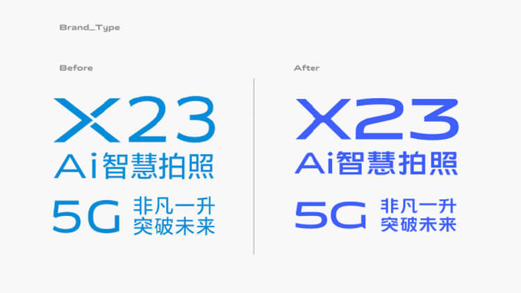
Vivo’s new coat of paint is Pantone 2386 (close to Aquamarine) from the previous 2925C (close to Cerulean). On the other hand, Vivo has also changed its logo typeface.
Take a peek at Vivo’s new branding below:

At first look, its new logo typeface looks almost the same as before. Without the new colorway, you wouldn’t probably ever notice the difference.
But looking closely, you can notice that it’s now more rounded and vertically compacted. This still uses a sans-serif font, yet, it’s been tweaked a little so that the corners of the new typeface is sharper than the old version.
This new scheme will also be used in Vivo’s other branding materials. From the devices’ logo, features list, and more.

Vivo’s flagship APEX 2019 smartphone will be the first device to bear the new logo typeface and color. This is just fitting since this device is also expected to revolutionize how normal brick smartphones look.
The Vivo APEX 2019 is expected to be unveiled on January 24.

